
Dracula was Yellow
✷ Dispatch No. 2. Dracula Was Yellow ✷
It has been almost a year since I wrote my first Sunday Dispatch.
I had imagined this becoming a regular little ritual — a place to share a person, place or piece of design that had caught my eye and made me fall in love with paper all over again. But life, as it tends to do, had other plans.
The last year changed me in ways I am still trying to understand. My mother died, and there is no elegant way to write around that. It was devastating. It still is. Grief has altered the shape of my days, and I know it will continue to do so for a long time. There are losses that sit beside you rather than pass through you, and this is one of them.
There were other blows too. My beautiful Luna died suddenly last November, which absolutely knocked me for six, and there were a number of accidents during a period when I was so exhausted I was barely functioning properly. I broke my leg. I lacerated my face. All while trying to raise two very small children and keep a business going,The Dispatch, understandably, disappeared.
So it feels unexpectedly lovely to be writing this again. I am not writing from the other side of grief, because I am nowhere near it. But I have started to feel little flickers of curiosity returning. I have found myself noticing colour again, saving references, buying books, following odd little trails of research simply because something has caught my attention. It feels familiar. Comfortable, even.
And I am choosing to take that as a good sign.
So, I’m back, baby... kind of.
And appropriately enough, I’m returning with something a little strange.
Bram Stoker’s Dracula was yellow.
Not black, burgundy or the deep Gothic crimson we have come to associate with vampires, velvet capes and candlelit castles, but yellow.
The first edition of Dracula, published by Archibald Constable & Company in 1897, was bound in this extraordinary acid, almost mustard-yellow cloth, with the title stamped boldly in red and enclosed by a fine red border.
There is no bat. No castle. No portrait of the Count. Nothing particularly Gothic about it at all.
Just that peculiar collision of red and yellow and one enormous word:
DRACULA
It is surprisingly graphic and, to my eye at least, strangely modern.
When I properly noticed it for the first time, I couldn’t stop thinking about it.
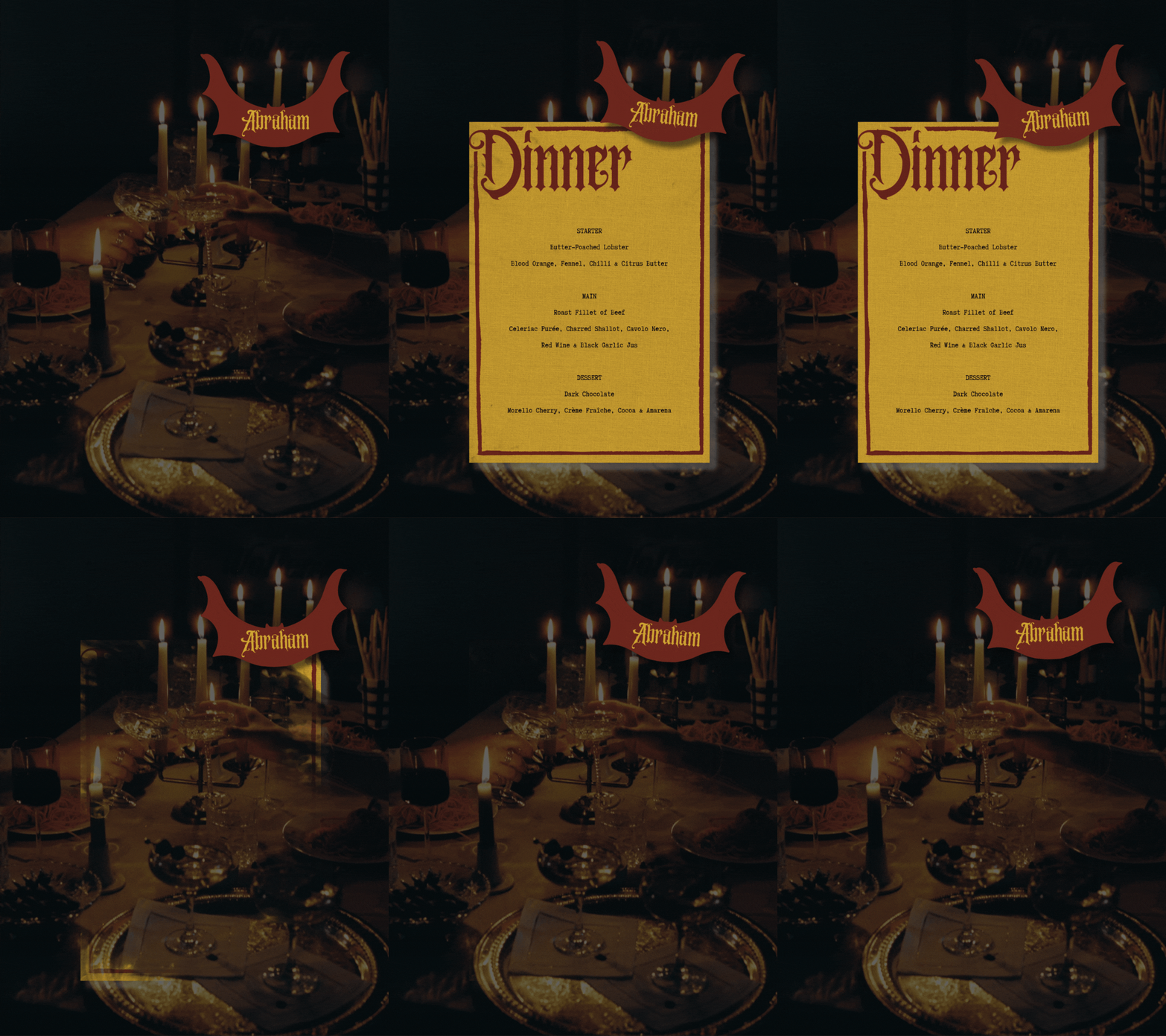
And so, naturally, I designed a dinner menu.
Before Dracula became Dracula
The Dracula we recognise now has had nearly 130 years to acquire baggage.
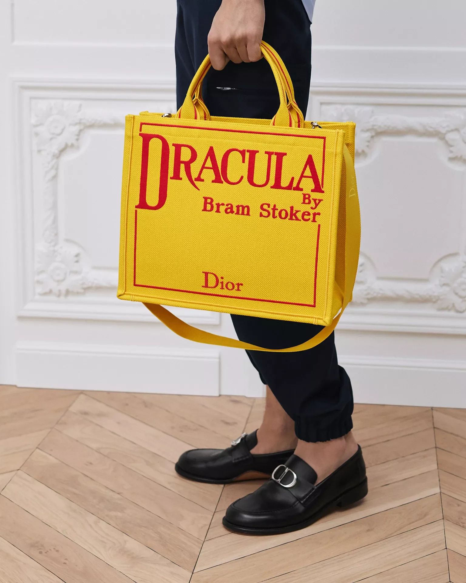
There is Bela Lugosi, Christopher Lee, sweeping black capes, widow’s peaks, fangs, candles, blood and every imaginable version of Gothic type. Dracula has been illustrated, filmed, parodied, romanticised and Halloweenified to the point that we almost instinctively know what “Dracula design” is supposed to look like. ( Speaking of baggage, Jonathon Andersons Tote is haunting me)
The original book does almost none of it.
Three thousand copies were sent to booksellers on 26 May 1897, bound in yellow cloth and lettered in red. Surviving copies now feel like objects from another design world entirely.
I haven’t found reliable evidence that Bram Stoker himself designed the binding, so I don’t want to retrospectively turn him into a graphic designer. What interests me is the object his story first arrived in.
There is something incredibly confident about it.
The cover doesn’t try to tell you what Dracula looks like. It doesn’t explain the atmosphere. It gives you a colour, a border and a name, and somehow that is enough. As a designer who is generally quite happy to add another illustration, another flourish and then perhaps one more flourish after that, I find this enormously irritating and inspiring in equal measure.
A local ghost
There is another reason I have always been curious about Bram Stoker.
He is from up the road.
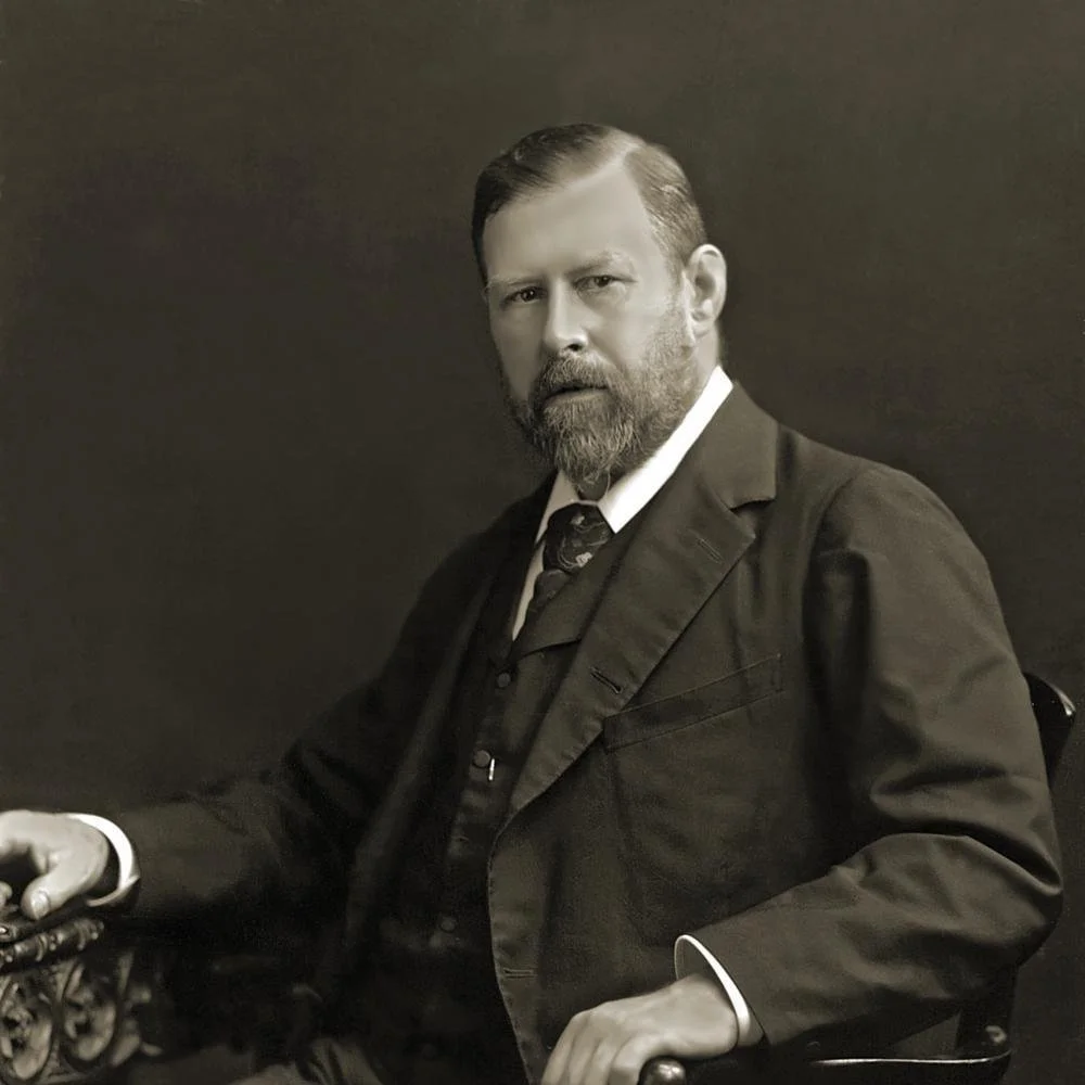
Stoker was born on 8 November 1847 at 15 Marino Crescent in Clontarf, only a short distance from where I live now.
When you live around this part of Dublin, his presence seems to hover somewhere in the background. His name appears on things, there are illustrations of Dracula here and there, and you grow up with this slightly peculiar knowledge that one of the most recognisable characters in the world came from the imagination of somebody who grew up around here.
I find the scale of that very funny.
Dracula feels enormous. Marino Crescent does not.
Clontarf was very different then, of course. When Stoker was born it was still essentially a village outside Dublin, although one rapidly becoming absorbed into the expanding city.
His mother, Charlotte Thornley Stoker, was also a formidable storyteller. She had grown up in Sligo and later wrote a vivid account of the cholera epidemic she had witnessed there as a child, full of fear, sickness, death and survival.
It isn’t difficult to imagine those stories leaving some impression on him.
What I like most about seeing Stoker through Dublin is that it removes some of the mythology.
He becomes a person again.
Before Transylvania, before the castle, before Count Dracula meant anything to anyone, there was a boy in Clontarf.
Another connection I am perhaps disproportionately fond of is that we both went to Trinity College Dublin.
Stoker entered Trinity in 1864, aged sixteen, and graduated in 1870. The version of Bram Stoker I had somehow constructed in my head before researching him was considerably more pale, tortured and bookish than the reality. Apparently not. He was huge, athletic and extraordinarily involved in university life. He played rugby, rowed and took part in athletics and gymnastics, while also becoming heavily involved in Trinity’s debating societies. He was one of the relatively few people to hold senior office in both the College Historical Society and the Philosophical Society And in 1868 he gave a paper with the rather wonderful title:
Sensationalism in Fiction and Society.
Long before Dracula, he was already thinking about sensation; about the stories that provoke us, disturb us, excite us or stay with us.
That idea feels remarkably familiar from a design perspective.
Good design can create a feeling before somebody has consciously understood why.
The weight of a piece of paper, the scale of a word, an unexpected amount of empty space, or the way one colour sits beside another can create an atmosphere before the actual information has even been absorbed.
That is what I find so interesting about the original Dracula.
Yellow ought to be cheerful. Red can be romantic or celebratory. Put those particular colours together, in that particular way, and something about them feels slightly wrong.
There is tension in it.
Bram Stoker was not a designer, but...
I wouldn’t describe Stoker as a designer in the modern sense of the word, because he wasn’t.
What I find much more interesting is that his actual working life was deeply concerned with presentation, atmosphere and the mechanics of creating an experience for an audience.
For much of his adult life, Stoker was more closely associated with theatre than literature.
In 1878, he moved from Dublin to London to work with the celebrated actor Henry Irving at the Lyceum Theatre, and managing the Lyceum became the primary occupation of his adult life.
His remit was enormous.
He coordinated seasons and international tours, dealt with finances and correspondence, worked on publicity and advertising, managed staff and entertained the extraordinary mix of writers, artists, actors and society figures who passed through the theatre.
The Bram Stoker Estate has a lovely account of his theatre years, and the more I read about them, the more I liked this version of him.
He wasn’t simply sitting at a desk imagining Gothic horrors. He was backstage. He was organising things. He was solving problems. He was making the thing work. There is even a story of a Lyceum production that required a gondola to move mysteriously across the stage. When the cloth concealing the mechanism slipped, the audience apparently caught sight of Bram Stoker underneath, in evening dress, physically operating the machinery.
I love this.
There is something immediately familiar to anyone working in a creative industry about being beautifully dressed while secretly holding the entire thing together with your bare hands.
Paper as theatre
In my first Dispatch, I wrote that stationery is the theatre curtain before an event begins, and perhaps that is why I find Stoker’s theatrical life so interesting.
A wedding doesn’t begin when somebody walks down the aisle. A dinner doesn’t begin when the first course arrives.
There is an atmosphere being created long before that. An invitation arrives through a letterbox. You walk into a room. There are flowers, music and light. You sit down and find your name waiting for you. You pick up a menu and, before you have even read it, the paper, typography and colour have already told you something about the evening you are about to have.
These things are tiny pieces of theatre.
They create anticipation.
For me, stationery has always been less about simply communicating information and more about creating that first feeling of a world somebody is about to enter. Stoker spent his professional life doing something vastly larger and more theatrical, of course, but the instinct feels familiar.
Dracula, the administrative nightmare
There is also something about the actual construction of Dracula that appeals very much to a designer’s brain.
The novel doesn’t have one conventional narrator. Instead, Stoker builds the story through a collection of documents: diaries, letters, telegrams, newspaper reports, medical notes and recorded testimony.
Everyone is constantly writing things down, copying them, transcribing them, typing them, passing them to somebody else and trying to put everything in the correct order.
Which means one of the most famous horror novels ever written is, in part, an absolutely enormous Victorian paperwork project.
I mean that with great affection.
The story only becomes visible as all of the separate pieces are assembled. One document changes how we understand another. Information is withheld and revealed. Different voices overlap.
It is storytelling, obviously, but it is also arrangement.
Editing.
Hierarchy.
What goes here? What needs to come first? What does the reader know at this point, and what do I want them to discover next?
These are questions designers ask all the time.
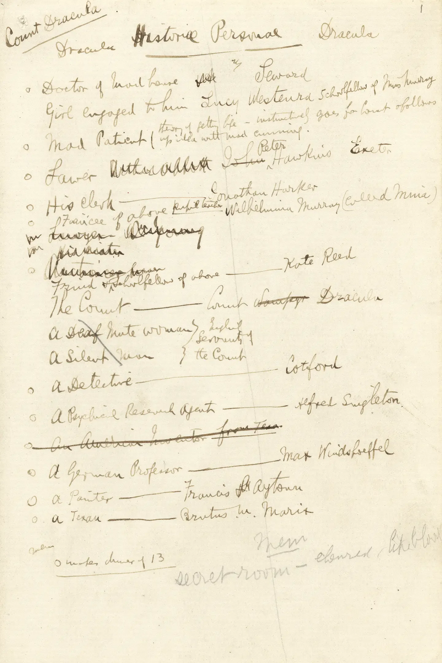
The surviving evidence of how Stoker worked makes this even more interesting. The Rosenbach Museum & Library in Philadelphia holds his original working notes for Dracula: pages of research, character lists, timelines, structural plans and fragments accumulated over years.
I love seeing the machinery underneath finished creative work.
We tend to encounter the final thing and imagine that it arrived fully formed.
It almost never does.
There are notebooks, bad ideas, things crossed out, changes of direction, research folders and versions nobody else ever sees.
Whether it is a novel or a menu, there is usually a small private disaster behind the finished photograph.
Harry Byrne’s and the Howth Road
And then there is possibly my favourite local connection.
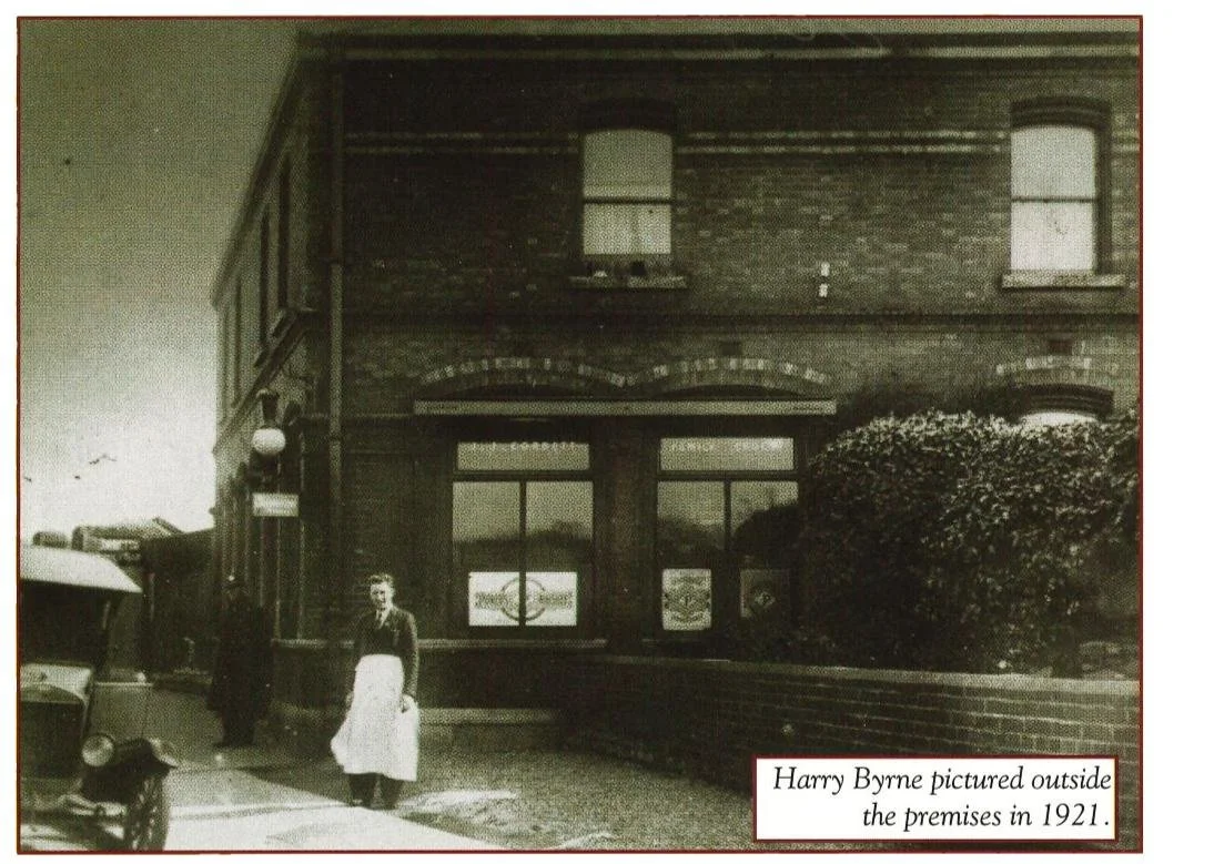
My husband’s family own Harry Byrne’s on the Howth Road.
The public house on that site traces its history back to 1798, when it began life as a coaching inn, and its own history names Bram Stoker among the well-known local figures who would have been familiar with the premises.
There are also stories that Stoker drank there, which I would dearly love to present as established historical fact, but I haven’t found the nineteenth-century bar tab yet. So we will leave that one in the lovely category of local pub lore.
During Stoker’s Clontarf years the premises passed through earlier owners, including the Carolan family. It later became associated with James J. Corbett, before Harry Byrne arrived in 1920. The Byrne family have owned it since 1947. But the place was there, teh same building my Father in law was brought up in, and my husband resided in as a small child.And there is something I love about that.
History has a tendency to flatten people into plaques and portraits, particularly when their work becomes more famous than they could ever have imagined. But people do not feel historical while they are alive. They walk the same roads everybody else does. They pass shops. They sit in pubs. They go to college. They complain about work. They eat dinner.
Somewhere amongst all that ordinary life, they make things.
I like imagining Stoker walking around the same little corner of Dublin that is so familiar to us now, long before he had any idea that one of his characters would still be discussed here nearly 130 years later.
Speaking of dinner...
One of the more delightful pieces of Stoker family lore concerns the origins of Dracula itself.
According to his son Noel, the beginnings of the story could be traced to a particularly vivid nightmare Stoker had after eating too much lobster.
The story goes that Stoker dreamed of a vampire king rising from his tomb after the ill-advised supper.
And when you are designing a dinner menu inspired by Dracula and discover that one of the world’s most famous vampires may have begun with an excessive quantity of shellfish, there is really only one appropriate response - Put lobster on the menu. So I did.
Designing my Dracula
Once I began designing the stationery, I realised fairly quickly that I didn’t want to illustrate Dracula at all- What interested me was the book as an object.
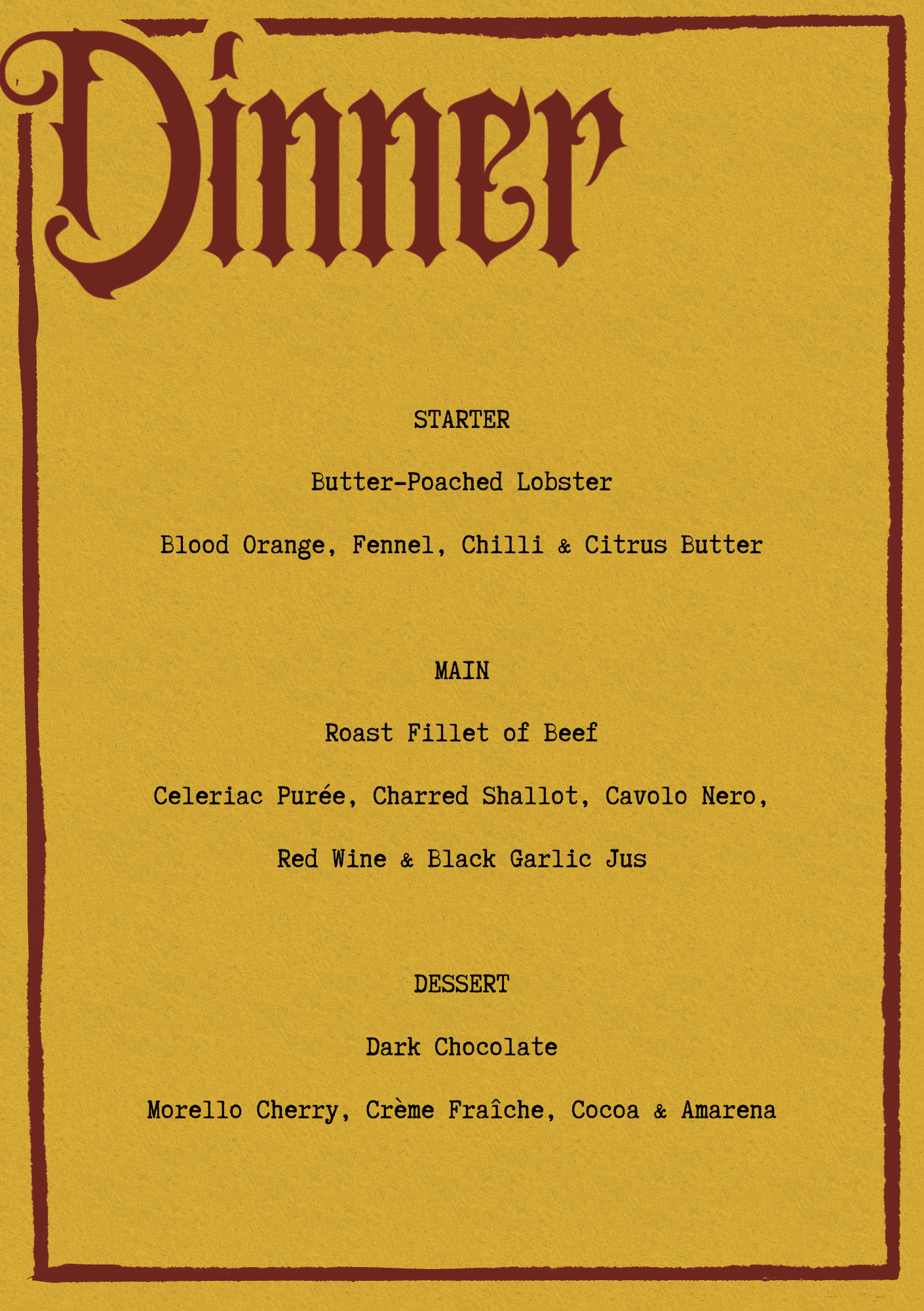
The menu is built around that same uneasy palette, with an oversized red title, a narrow red border and deliberately simple typography for the food itself.
The word Dinner became the decorative element rather than adding bats, blood or any of the imagery we now automatically associate with Dracula. The rest is intentionally restrained.
Even the food became part of the reference.
The starter is butter-poached lobster, partly as a nod to the wonderful family story about Stoker’s nightmare, while blood orange, red wine, dark chocolate and Morello cherry quietly continue the colour story without needing to announce the theme.
That is generally the kind of reference I like most in design: something that still works perfectly well if you don’t know the story, but becomes a little more interesting once you do.
The more I worked on it, the more I appreciated just how little that first edition actually needed.
There is something almost awkward about the colours together, which is precisely why I like them. They are beautiful, but they aren’t soothing. There is a slight visual vibration between the red and the yellow that gives them energy, a dissonance. It also made me think about how much imagery we inherit without ever really questioning it. Our collective image of Dracula has been designed and redesigned so many times that the original visual identity of the book now feels almost radical by comparison.
No vampire.
No face.
No explanation.
Just DRACULA.
There is confidence in that.
Back to Dublin
I think that is why this project ended up meaning more to me than I expected.
It began with the colour of the first edition, but the further I went into the research, the more personal the story became.
Stoker was born only a short distance from where I live now; he studied at Trinity, as I did; and one of the old pubs that formed part of the landscape of his Clontarf is now owned by my husband’s family.
None of those connections are important on their own, and I don’t want to overstate them, but together they gave the project a sense of place that I hadn’t anticipated when I first started looking at that yellow and red cover. What I found most interesting was how much of Stoker’s world seemed to sit somewhere between writing, theatre, atmosphere and presentation.He spent years working behind the scenes at the Lyceum, helping to create experiences for audiences, while Dracula itself is constructed through journals, letters, newspaper reports and fragments of information that only make sense when assembled together.
As a designer, that feels very familiar to me.
So the stationery became less about illustrating Dracula and more about responding to the object that first introduced him to the world. I kept coming back to the yellow cloth, the red typography and the simplicity of that original cover, because it already contained so much character without relying on any of the imagery that came later. Before the films, the cape, the bats and the visual language we now associate with Dracula, there was simply a yellow book with a red border and one enormous title.
Nearly 130 years later, that still feels remarkably bold.
And after a year in which I haven’t always felt particularly able to make, write or even look very far beyond what was immediately in front of me, it feels very good to have followed a peculiar little thread of curiosity again simply because I wanted to know where it led.
Perhaps that is the real reason I wanted to write this Dispatch.
It feels nice to be curious again.
Jess x